Here’s the rundown of the pros and cons of the web design platform, Showit (the go-to platform for entrepreneurs who want complete creative control over their websites).
*Last updated February 2026.
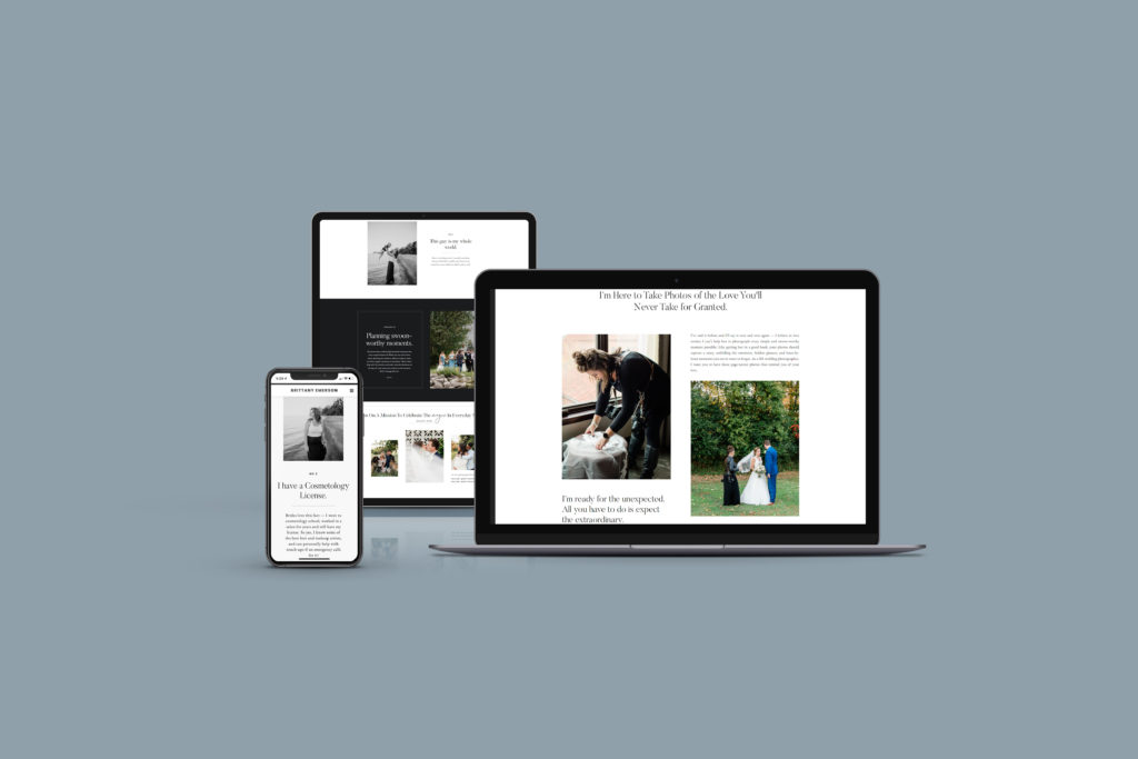
So, what is Showit?
Showit is a web design and hosting platform that allows you to create a completely custom desktop and mobile website, all with a drag-and-drop interface that requires no coding. It integrates with WordPress for easy blogging and SEO. You can start from scratch or use a template (like from Northfolk or Tonic) to design the perfect website.
It’s a total game-changer because you can build your entire website from scratch, without stressing over DIYing code or hiring developers. I built my site on Showit with the help of a Foil & Ink template and a few Northfolk designs, and I haven’t looked back.
I’ve used Wix, WordPress, Squarespace and even Weebly…and none of them compared. I more than doubled my revenue in my first year using Showit. (We’ve been using the platform since 2019 if you’re wondering.)
Is Showit the same as WordPress?
Showit is a design and website platform that is different from WordPress, but it uses WordPress for the blog! Essentially, Showit and WordPress work as a pair. When you pay for a Showit subscription with a blog account, you’ll use Showit to design the website, and then you’ll log into WordPress to write and publish blog posts.
And if you’ve ever heard of Yoast, you get access to that in your WordPress account (which is a great tool for SEO)! I’m an SEO expert and Yoast works beautifully for me with the free version.
Pros of Showit
Limitless design ability – no coding
My absolute favorite part of Showit is the ability to create ANYTHING you want. Envision an interactive overlay filled with gorgeous custom fonts and any design you can think of — it’s possible. Because of its drag-and-drop system, you can put anything anywhere and you’re not limited by a cumbersome interface or restricted template. Did I say no coding? Yep, it’s code free which means you don’t need to learn a new language to build a beautiful website.
Custom mobile site
With Showit, you can design a custom mobile website — just as you do the desktop version. Seeing as Google is conducting mobile-first indexing now (as in, Google looks at your mobile site first to see where you should be ranked), it’s definitely important to prioritize your mobile experience.
Of course, you can drag and drop your mobile design just as easily as the desktop version.
Keep in mind that a lot of website design platforms create the mobile version based on the desktop design. This means you’re usually limited in terms of what you can do, but not with Showit. While it can take more time to perfect, you can build a great mobile experience.
I love one of Showit’s newest features on mobile/desktop design, which is the fact that I can “split” the settings. If I want a different font on the same headline, or a different size for the mobile viewer, it’s easy to set that up!
Your branding will be spot-on
Showit allows you to completely customize everything from the fonts to the colors and of course the design itself. This allows you to perfectly match your website to the expensive branding you invested in.
Want something bold or bright? Easy. The same goes for editorial and minimal designs.
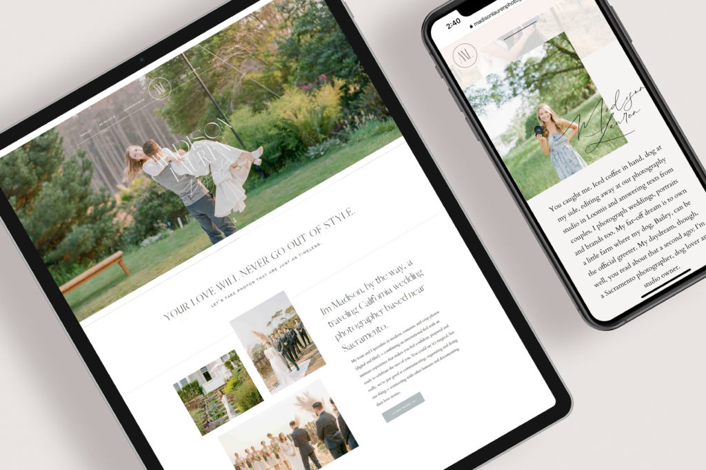
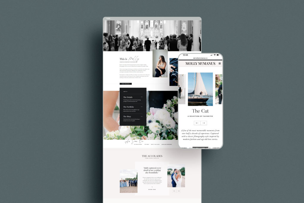
See a luxurious Showit website here, and enjoy a bold, stand-out design here.
Simple to edit & manage long-term
When your portfolio needs new photos, or your headline needs a tweak, it is beyond simple to make those adjustments (which is necessary for SEO and a fresh user experience). I’ve had the same base website for about 5 years now, and it’s worked as a beautiful foundation for the long-term evolutions of my business. I’ve added new pages, built a shop, re-written the copy, changed my SEO focus, and more. It’s never gotten in the way of my business growing. If you’re a solopreneur, or even a brand experience manager for a large company, Showit gives you the power to take full control over your website and everything it puts forward in the name of your business.
Countless templates available
If you don’t have the funds to hire a custom designer, there are a myriad of templates available to DIY with. You can even hire a designer to customize your Showit template for you. This helps it to look more one-of-a-kind, and ensures that it’s expertly published on your behalf. See more templates below.
Responsive, human chat support
I’ve actually had the chance to meet some of their customer service representatives in person and they’re just as helpful and human in the real world as they are online. This is a big WIN especially if you’re used to platforms like WordPress where contacting someone for help feels nearly impossible. If you run into issues or can’t solve something, they will look at your specific website and provide custom support.
Supportive community & incredible connections
This pro is a tie for my favorite — Showit has one of THE best Facebook Groups I’ve seen, as in, there’s a whole group of other business owners (13,000 and counting) who are chatting it up in an active Facebook Group. In there, you’ll find discussions on everything from website design, best Showit tips and tricks, managing clients and so much more. I’ve gained friends and clients from this group! It’s a winner and is just another added benefit when you use Showit to build your business website.
Applicable to every industry
A common question for Showit that I hear — “Is Showit just for photographers?” Absolutely not! While it was originally built for photographers (because of how important their visual impression is), the Showit team quickly realized that many other industries need a beautiful website too. If anything, you’ll find that many Showit templates offer an in-depth portfolio because of this, but otherwise, there isn’t a major addition or exclusion with Showit that makes it better or worse for certain industries.
To put it simply, if you want to look good and benefit from the SEO capabilities of WordPress, Showit is great for you regardless of what you do (with the exception of shops that have 50+ products — scroll for more on that)!
So many tutorials from pros & peers
If you get stuck, you can ask the Facebook group or just pose a simple Google search. You’re likely to find a lot of straightforward tutorials that will help you — whether you want to add an interactive quiz, embed an email opt-in, update your color palette or adjust your contact form (I use Dubsado for mine).
A successful option for web designers too
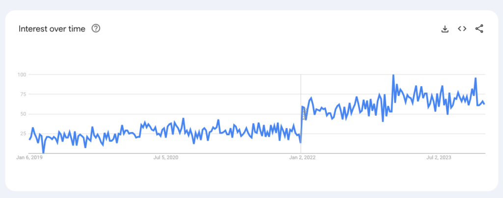
If you’re a website designer looking to switch platforms because you love design, but despise technical hold-ups and coding, Showit is the choice for you. They have their own certification program that allows you to be recommended as a Showit design partner, while providing you with ample resources, networking opportunities and more. Below is a screenshot from Google Trends from the last 5 years. You can see that the interest in this platform is only growing (which equates to clients for your business.)
P.S. Northfolk teaches you how to sell templates with their program, Revolving Revenue. Tell them we sent you (or rather: use that link) for a discount! You’ll love the co-founders, Sam and Rachel. Relatable and genius.
And if you’re not a designer, this simply means that there are plenty of trustworthy design providers out there.
Cons of Showit
There’s a learning curve
If you’re familiar with the Adobe suite (InDesign, Illustrator, etc.), Showit will come to you naturally. For those without a huge design background, though, it can be overwhelming at first. But, there are many tutorials and resources that make it easy to learn if you put your mind to it. (And trust me, you started a business. Building a website on Showit is a fun piece of the puzzle!)
It can be challenging for large e-commerce brands
If you’re planning on selling hundreds of products, Showit probably isn’t the best option for you. However, Showit does integrate seamlessly with e-commerce plugins (like Shopify) to help you easily sell a curated collection of products (less than 50 is best). My friend at MKDesign Studio has some super helpful resources for creating a digital shop with Showit.
We use Showit with Thrivecart for our website copywriting templates, and we love it! This gives us the option to have a custom design for shop and product pages, in addition to a straightforward purchase system and personalized check-out page (where yes, we credit our dog as employee of the month).
The custom process can take a long time
If you choose to build from scratch, your website creation might be a bit long-winded. It’s super worth it, though! You can get started with their templates to help speed up the process! Check out these Showit template shops as I’ve seen their results firsthand with myself and my clients: Northfolk, Foil & Ink and Tonic.
Slightly higher monthly fees
Although the monthly price is fairly low at $19-34 a month, this is actually a bit higher than what you’ll typically find for website hosting on other platforms such as WordPress or Wix. See the Showit pricing.
The mobile side is easily overlooked
It’s so quick and easy to update anything you want, i.e. that bio on your about page, or the layout for your services. But the mobile side is easily forgotten. I have to admit — I’ve updated my website only to realize a few days later that I ruined a few mobile views in the process. I can always fix it in 10 minutes or less, but don’t forget to double-check your custom mobile view if you change anything on the desktop view.
Frequently Asked Questions about Showit
Does Showit include hosting?
Yes! Hosting is included in Showit’s pricing!
Is Showit good for SEO?
In short, yes! See the full post on this Showit SEO question.
Showit has all of the features necessary for search engine optimization or SEO. You can easily update meta descriptions, page titles and more. Plus, Showit integrates with WordPress for the blog, which means you can use plugins like Yoast to make sure that your blog SEO is on point. (Just don’t forget to compress and optimize your images with a tool like ShortPixel before you upload them!)
Remember, SEO comes down to the quality and amount of content on your website, and also takes into account many additional factors such as social media presence and online reviews. Some will argue that WordPress or Squarespace are better, but in my experience (with hundreds of SEO copywriting projects), Showit has the exact same settings and abilities necessary to drive online traffic to your site. And since Showit uses WordPress for the blog itself, you get the best of both worlds.
Plus, if you find that you’re better able to update, manage and create a beautiful user experience with Showit, your SEO will improve. Google likes websites that people like exploring. (As opposed to a clunky, hard-to-use website that you can hardly work your way around.)
To really optimize your Showit website, try creating a WordPress home page to get the benefits of WordPress with the look of Showit. More on that here.
Is Showit just for photographers?
A lot of Showit users are photographers, but this is because these are visual business owners who care a lot about how their websites look! As such, Showit previously focused a lot of attention on this group. However, Showit now caters to all businesses — because all brands want to look good!
I’ve seen realtors, fitness companies and e-commerce brands use this platform.
Showit Website Examples
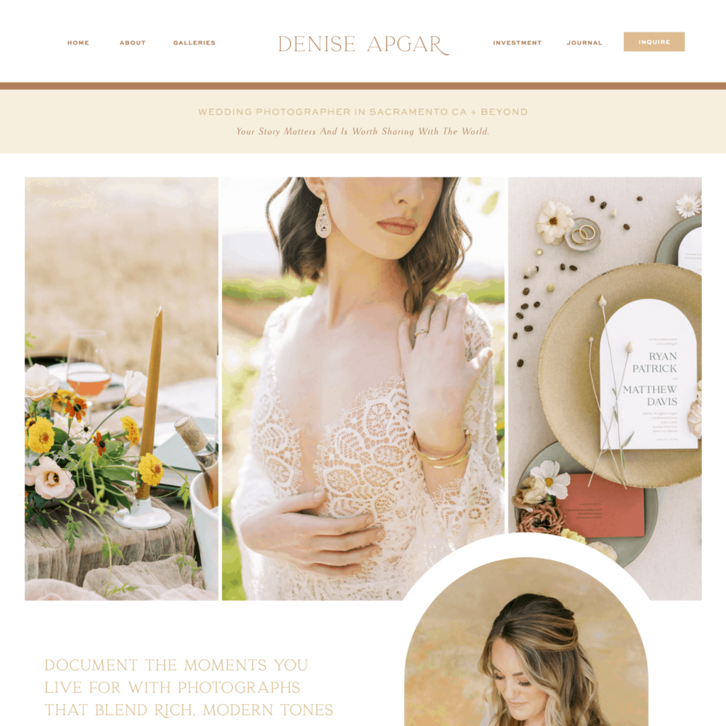
For a photographer
See the live version of this website for a wedding photographer in Sacramento, CA. (Designed by Foil & Ink.)
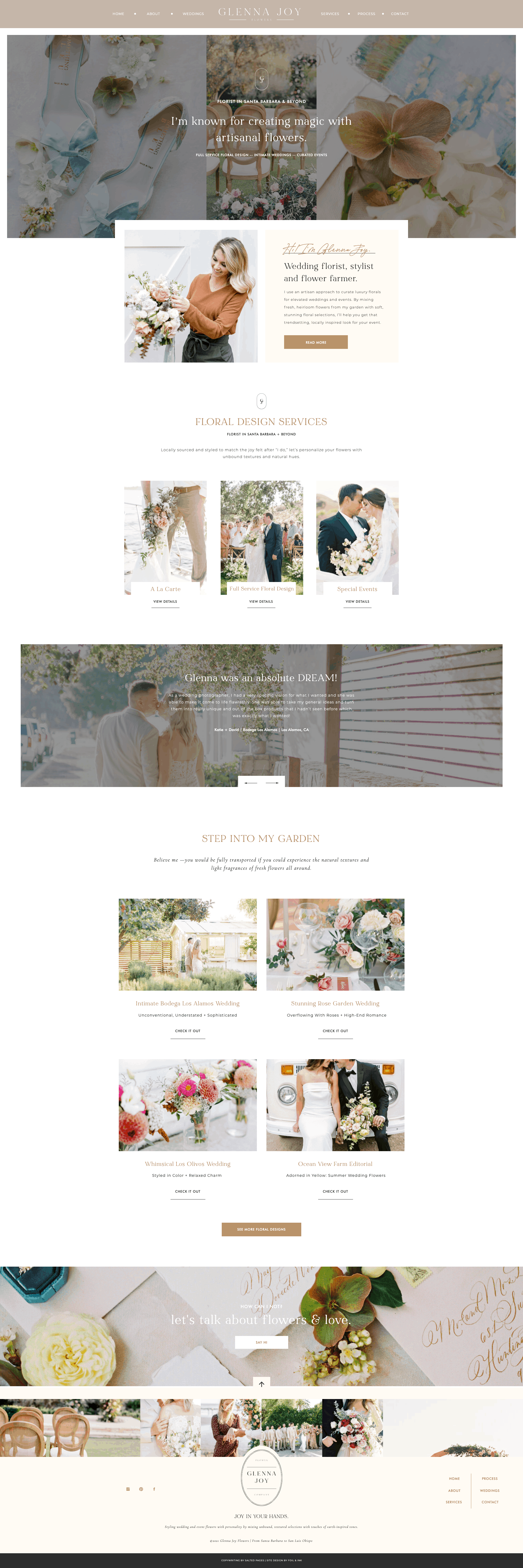
For a florist
See the live version of this website for a florist in Santa Barbara, CA. (Also designed by Foil & Ink on Showit.)
For a live wedding painter
Who earned six figures for the first time after launching! See this full website here. (Designed on Showit by Studio Stefan.)

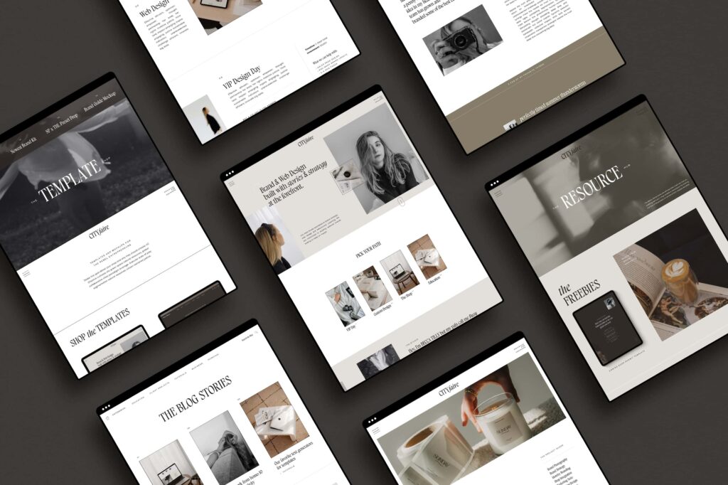
For a web designer
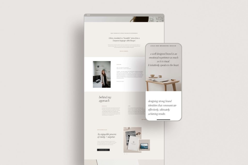
Where to buy a Showit website template
These are my favorite places to buy Showit website templates — in no particular order. Find more Showit designers here.
- Northfolk
Designed by two of the most talented, kind and creative Showit designers you’ll ever meet. Their templates are jam-packed with more content opportunities (which I love as an SEO copywriter). Use the code: NORTHFOLK15 for 15% off and sail off into the sunset with a template that pushes the envelope on sales. - Tonic Site Shop
That feeling of a chic, boutique bar, but make it a template shop. Tonic is full of stylish, converting website templates. The code, SALTEDPAGES, will also give you 15% off here! - Studio Stefan
The coveted European feel, but still sleek and inviting. That’s what you’ll find with Meg Stefan’s collection of Showit templates. (In full transparency, we loved Meg’s templates so much that we partnered together to provide built-in copy with each template you purchase!) - Foil & Ink
The template shop we’ve been using for our brand, their designs are fresh and full of the calls to action we love and recommend using for high conversions.
Showit templates for photographers
While you’re at it, I would highly recommend the Elevated Experience templates from Studio Stefan — a whole collection of experience-based Showit templates for photographers. We partnered with them this year to create the content you use on your back-end every single month for conversions like your client proposals and welcome guides.
And they’re not just beautiful — there is pre-written copy from Salted Pages included with every template for you to use as is. This makes these templates the easiest to customize because you literally just need to add your photos, branding, and drop in your own name and pricing. The rest is ready for you to hit publish within minutes. (Most templates do not include the wording for you to run with.)

They’re ideal for wedding photographers, and can be adjusted for any photographer or wedding niche.
You’ll find the…
- Client proposal (that you can tailor and wow clients with)
- Investment guide (to share before or after inquiries from potential couples and even other vendors/venues!)
- Welcome guide (to streamline your experience and set expectations)
- Pricing sheet (for a minimal a la carte overview of your offers)
- Heirloom guide (to help you sell more high-end products like albums and prints)
- And the whole set if you’d like, and for $50 less
Get a free month of Showit
Use the code, saltedpages, for a free month of Showit. I designed my entire website when I first had my free trial in 2019 (time flies). Then, when I was ready to launch, I signed up and have loved the results ever since. As a six figure business owner, no other platform has tempted me.
See more examples
Want to see more Showit websites? Here are some recent favorites to show you what’s possible. All of these were launched or heavily updated in 2025.
- Sentimental Fools, a beautifully creative wedding planner whose work should be in a museum
- Memory Box Photography, destination wedding photographers in Mexico
- Forma, a luxury wedding agency
- Hilltop Design Build, an interior design and remodeling company in Colorado
- Jennie Lou Art, a live wedding painter site designed by Meggan at Studio Stefan
Have any questions on the pros and cons of Showit? Let us know in the comments! Reach out here if you need custom website copywriting (with the impact of custom SEO keywords) for your new Showit site. We also offer Showit template customization services.
June 3, 2020


